Customize Ribbon Tabs
 Updated 10 months ago
by
Kerry Poe
Updated 10 months ago
by
Kerry Poe
Customize Ribbon Tabs

Summary
Used to customize the name and contents of the eVolve tab(s) in the Revit ribbon.
- eVolve tab ⮞ Utilities panel ⮞ Toolbox Configuration button


Prerequisites

Usage
Opening the Customize Ribbon Tabs configuration window
- From the eVolve ribbon, in the Resources panel, click the Settings menu, then click Customize Ribbon Tabs.
NOTE: By default, the Resource tab resides on the main eVolve tab. However, if you choose to remove it from the main tab, keep in mind, it MUST be visible on at least one tab.

Importing/Exporting Configurations
- From the Customize Ribbon Tabs window, in the upper left corner of the window, click
 or
or  .
. - Specify the file path in which you would like to either import a configuration from, or to where you like to export your current configuration to
- Click the Save button when exporting, or the Open button when importing.

Defining tabs
- From the Tabs grid, in the Data Navigator, click Add
 .
. - From the newly created row, in the Name column, enter a name/title for the tab in the appropriate cell.
NOTE: the rank is automatically assigned; however, if you wish to change the tab's location in the ribbon, you may do so now. Ranks are displayed from left to right, starting at the current location of the eVolve tab. - Click the Apply button to save and continue configuring tabs or OK to save and close the window.
Defining panels
- From the Panels grid, in the Data Navigator, click Add .
- From the newly created row, click the Panel Name cell, from the menu, click the panel name.
NOTE: the rank is automatically assigned; however, if you wish to change the location where the panel appears within the tab, you may do so now. Ranks are displayed from left to right, with #1 appearing to the far left.
- Click the Apply button to save and continue configuring the toolbox or OK to save and close the window.

Window Overview
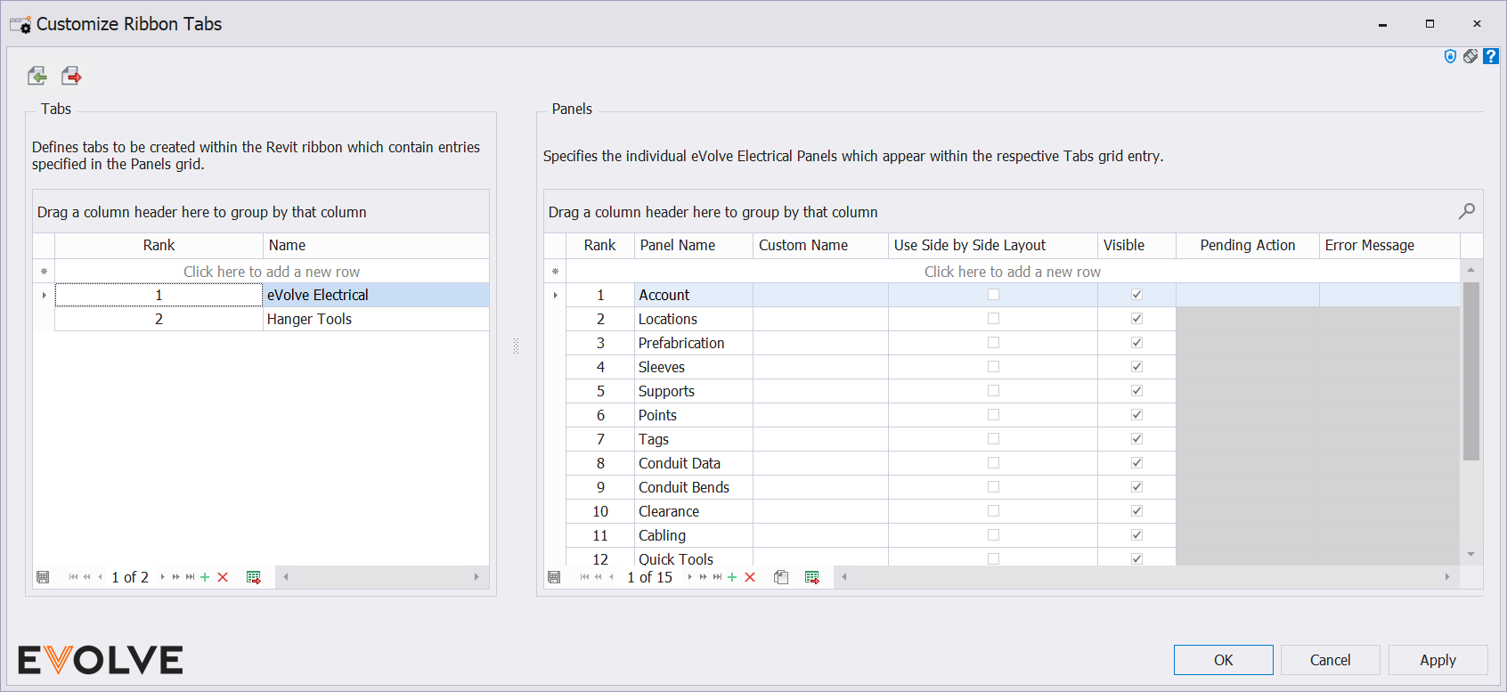
Customize Ribbon Tabs window
Import/Export Configurations buttons
- Import Configurations - Reads the user selected file and restores the window to the exact configuration of that specified in the selected file.
- Export Configurations - Saves the current configuration on the window to a selected file.
Tabs panel
- Grid columns
- Rank - defines the order in which this tab appears in the ribbon.
- Name - defines the tab name/title.
- Data Navigator buttons
- Add - creates a new row in the grid.
- Delete - removes the selected row from the grid.
- Export to Excel - exports the grid as currently displayed to Excel.
Panels panel
- Grid columns
- Rank - defines the order in the respective tab where this entry appears.
- Panel Name - defines the panel to include.
- Custom Name - (optional) - If provided, this will be used as the panel text for the entry instead of the default text.
- Use Side by Side Layout checkbox - When enabled, icons are presented using large buttons with text for each feature.
- Visible checkbox - Specifies if this entry is visible.
- Data Navigator buttons
- Add - creates a new row in the grid.
- Delete - removes the selected row from the grid.
- Duplicate - makes a copy of the selected row.
- Export to Excel - exports the grid as currently displayed to Excel.

Tips and Tricks
- While the Account and Resources tabs may be removed from the "main" eVolve tab, they MUST appear on at least one tab.
- While all panels may appear multiple times and on multiple tabs, the Integrations panel may only appear on one tab.
- Using Side by Side Layout will ensure the name of the command is displayed.
Best Practices
- Use multiple tabs to take advantage of the Use Side by Side Layout feature. Each button will always be visible (even on lower screen resolutions), and the button name text is displayed. This makes it easy to find your favorite buttons and new or unexplored buttons.
