Using grids in EVOLVE

This document is intended to help navigate through DevExpress grids. While the document may not go over all available options, it should help provide a basic understanding to help better utilize the functionality of the DevExpress grids. The functions and processes contained within this document are not product-specific and may be applied to all eVolve software.
GridView
The GridView is the default Data Grid View that displays data in a traditional tabular format. Each data source record is represented as a row; all data source data fields have related columns. Data portions are stored within individual cells.
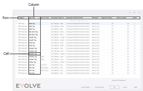

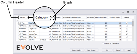
Columns
Arranging
Columns can easily be reordered by dragging them to a new location. With the mouse, click and hold on the column header, then drag the header to the left or right. As the header is dragged over other headers, arrows indicate available spots. Once the header is in the desired location, release the mouse button.
Hiding columns
Right-click on each unwanted column-header and click Hide This Column.
To restore hidden columns
- Right-click on any column header and click Column Chooser. A Customization panel appears.
- From the Customization panel, click and hold on the column header with the mouse, then drag the header to the header row in the grid. As the header is dragged over other headers, arrows indicate available spots. Once the header is in the desired location, release the mouse button.

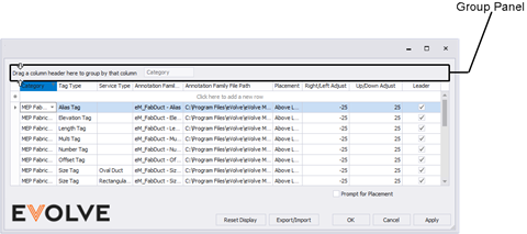
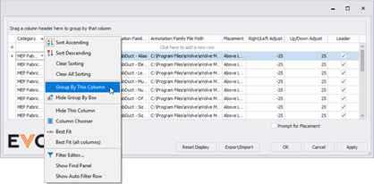
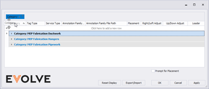
Grouping
Grouping Data
Drag a column header into the Group Panel to group data by a column.
Another option is to right-click a column header and select Group By This Column.
Ungroup Data
Drag a column header from the group panel to the column header panel to ungroup data.
Another option is to right-click a column header and select Ungroup from the context menu.
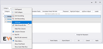
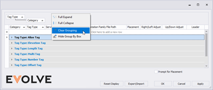
To remove all grouping, right-click the group panel and select Clear Grouping.
Multi-Column Grouping
When data is grouped by multiple columns, you can drag a column header to another position within the group panel to change the group order.
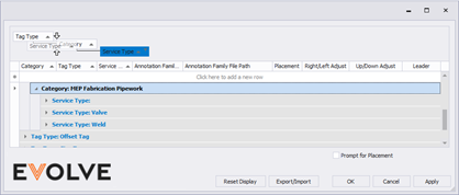
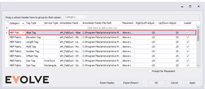
Merged Column Grouping
Hold the Ctrl key when dragging column headers into the group panel to group data by multiple columns at once.
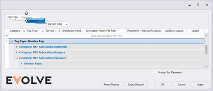
Compare how the row information is displayed as compared to the image above.
TIP: Drag a column header while pressing the Ctrl key to re-arrange column headers within merged filter blocks.

Sorting
Sort Data
By default, data may be sorted by any column. Click a column header once to sort data ascending. Consequent clicks will reverse the sort order. Sort glyph (up or down arrow) in column headers indicates the current sort order.
To sort data by a specific column, right-click the column's header and select Sort Ascending or Sort Descending.
Multi-Column Sorting
The Data Grid discards the currently applied sorting when a column header is clicked and keeps the sorting when applied through the header’s context menus. Thus, to sort data by multiple columns, use header context menus or hold the Shift key down when clicking column headers.
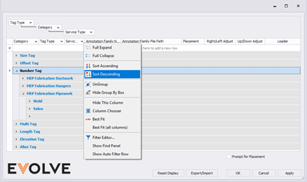
In the image above, note how Tag Type is sorted ascending, Category is sorted descending, and Service Type is sorted ascending.

Record Navigator
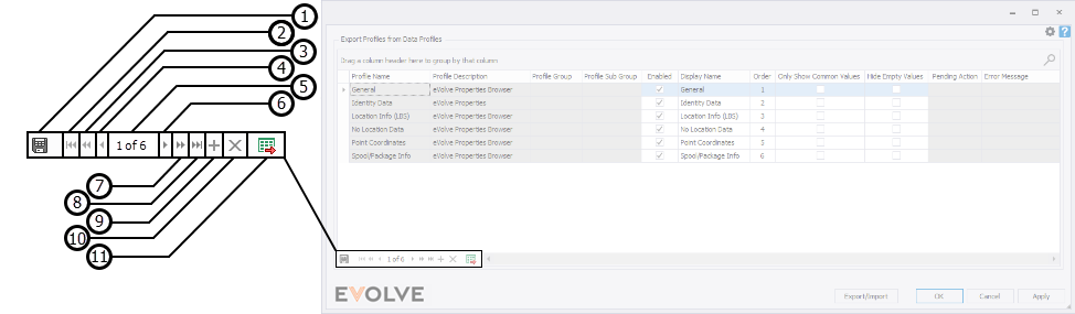
- Save Grid State -
- First - Used to select the record at the top of the grid.
- Previous Page - For grids, a page is considered all records displayed within the bounds of the current grid. This function fills and displays the records of the preceding page as if you were to scroll up.
- Previous - Selects the record above the currently selected record in the grid.
- Record indicator - displays the currently selected record's numerical value and the grid's total number of records.
- Next - Selects the record below the currently selected record in the grid.
- Next Page - For grids, a page is considered all records displayed within the bounds of the current grid. This function fills and displays the records of the succeeding page as if you were to scroll down.
- Last - Used to select the record at the bottom of the grid.
- Add New - Used to create a new record.
- Delete Selected - Used to remove existing record(s).
- Export to Excel - Used to export the grid as currently displayed in a .xlsx format.
Conditional Record Navigator buttons
Some of the eVolve grids have different data and functional requirements. While most eVolve grids do have and share common functionality, the following buttons may or may not appear in the Data Navigator.
- Bulk Update - Used to update parameter values for the selected records.

- Duplicate - Used to copy the record currently in focus or records that are currently selected in applicable.

- Export to Data Tables - Sends the information currently displayed in the grid to Data Tables.
NOTE: hidden columns are not exported.

Filtering
When filtering is applied to a View, displayed records are restricted to those that meet the current filter criteria. Data may be filtered against single or multiple columns.
Filtering Dropdown Menus
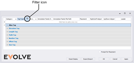
To invoke a filtering dropdown menu for a column, click the filter icon within the column header.
In the Values tab, users can select specific cell values from those that the Data Grid currently displays.
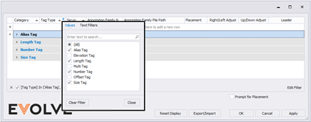
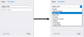
The Filters tab gives users a wider pool of filtering options. For example, when filtering by dates, you can only show records corresponding to the previous week.
The content of a filtering dropdown menu depends on the data type displayed by the related grid column. For instance, the figure below illustrates what this menu looks like when filtering by a text column.
While some features may not be applicable, you can view more information about grouping, sorting, and filtering DevExpress grids on the DexExpress website.
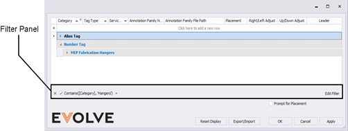
Filter Panel
When filtering is applied, a View shows a filter panel. The Filter Panel is used to modify and remove current filters.
Filter Editor
The Filter Editor dialog allows end-users to build complex filtering criteria combined from multiple expressions. To invoke this dialog, end-users can do one of the following:
· click Edit Filter in the Filter Panel
· Right-click a column header and select Filter Editor
More information about the Filter Editor may be found on the DexExpress website.
Row Error States
In grids that require data validation, the two fields below are particularly important when troubleshooting issues:
- Pending Action
- Error Message
However, determining why the grids are not working or displaying data as intended may be next to impossible if those columns are hidden. Now, with the release of the 7.4 version of EVOLVE, if a row gets put into an error state, it will be outlined in red to indicate there is an issue. At that time, if the Pending Action and/or Error Message columns are hidden, users may unhide these columns to troubleshoot their issue.
See the Columns section above for more information on hiding and restoring hidden columns.

Learning Tracks